Air Quality Forecasts
During a pandemic the air quality might not be seen as the most pressing issue but, according to the World Health Organization (WHO), air pollution kills an estimated 7 million people world wide every year. If we wonder what might be the situation in Europe, the European Environment Agency (EEA) would inform us that in 2018 nearly 379000 premature deaths were attributable to particulate matter (PM2.5) and 54000 to NO2. The WHO has established some guidelines on the quantity of certain pollutants above which an impact on the health of the population is expected. For example PM2.5 should not exceed 10 \(\mu g/m^3\) and NO2 should not exceed an annual mean value of 40 \(\mu g/m^3\) or a 1-hour mean of 200 \(\mu g/m^3\). Given the relevance of these pollutants for the population’s health, every country and region in Europe has built a network of ground stations to monitor them, like those managed by the Agenzia Regionale Protezione Ambientale del Lazio (ARPA) for the Latium region in Italy. The data from the ground stations in Europe are collected by the EEA and assimilated by the European Centre for Medium-Range Weather Forecasts (ECMWF) and other eight institutions across Europe into their air quality models for analysis and forecasts. The numerical models are able to provide an estimate of the concentration of the pollutants in areas that are far from the ground stations with a spatial resolution of 10 km. The ECMWF provides through its Copernicus Atmosphere Monitoring Service (CAMS) the analysis and forecasts about the air quality as the median of the ensemble of the models. The data about gas traces such as NOx, Ozone and SO2 are now available also from satellites, e.g. Sentinel 5-p through its sensor TROPOMI and MetOp through GOME-2 but in this post I want to show how the model forecasts from the CAMS service can be fetched by everyone and visualized in an animation on a web page.
The Copernicus Atmosphere Monitoring Service
The Copernicus Atmosphere Monitoring Service (CAMS) provides information related to air quality, atmospheric composition, greenhouse gases, solar irradiance. The datasets released by the CAMS service is the result of assimilation processes in which observations from satellites and ground stations are used to update and correct every hour the estimates computed by a numerical model of the atmosphere. The CAMS is operated by the European Centre for Medium-Range Weather Forecasts (ECMWF) on behalf of the European Commission.
CAMS European air quality forecasts
The CAMS provides its datasets as open data, available to all for free, through a web page and a web service. For the European air quality forecasts a user can select, among other options
- the variables, that is the physical parameters she is interested in
- the model she wants to use (nine models are available, plus the ensemble)
- the levels, or heights for which she wants the forecasts
- the area of interest, delimited by north and south latitudes and west and east longitudes
- the dates from which the forecasts should start
- the lead time hours, that is the hours of the forecasts
- the format of the data (CSV, GRIB, NetCDF)
If you want to set up a service based on the data provided by the CAMS you will likely use the web service API. In order to use the API, you have to be registered into the Copernicus Atmosphere Data Store (CADS) and follow these steps
- login
- copy your ADS API key in the .condarc file in your home folder
- install the cdsapi Python package
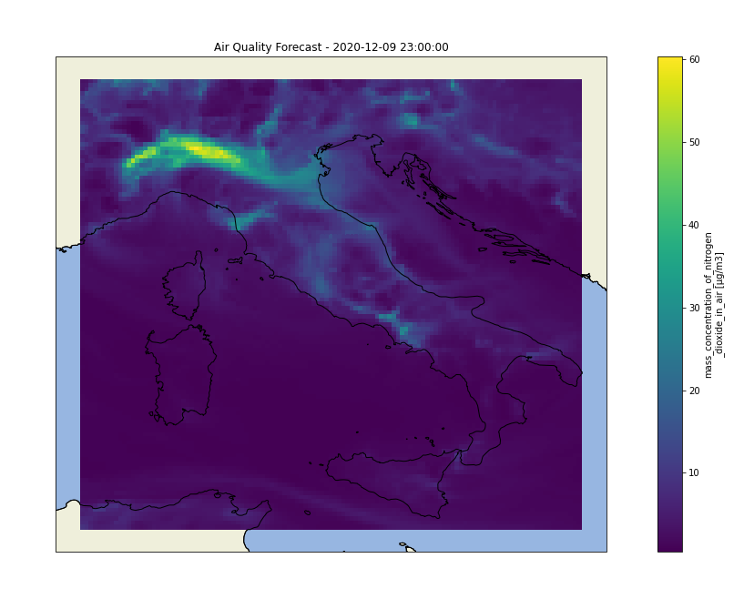
For more information on how to register to the CAMS follow the how-to instructions. The NetCDF format is easy to use in Python with the xarray library. If you choose one single day as the start of the forecasts the file returned by the service will contain the forecasts in a multidimensional array. The name of the dimensions (metadata) are standardized and a description is provided in the file. We can easily visualize the data for one forecast using Matplotlib. Here is an image of the concentration of \(NO_2\) at ground level where we can clearly see that the concentration will go well beyond the annual mean limit recommended by the WHO in most of the Po Valley.
The Jupyter Notebooks
If we have requested the forecasts at different lead time hours we might want to visualize each forecast as a frame in an animation. The details on how to create an animation with Matplotlib are a little bit more convoluted but a Jupyter notebook is available on my Github repository with an example of an animation built on a sequence of hourly forecasts for 4 consecutive days. The Python code can be used to fetch and visualize other variables with a little work and a different selection of the request’s parameters.
Conclusion
I find the Jupyter notebooks a great tool to test ideas and publish the results of experiments. The Jupyter notebooks are used by EUMETSAT for their highly recommended training courses. Wekeo, one of the Copernicus Data and Information Access Services (DIAS), provides virtual machines with a Jupyter Lab instance that can be used to write notebooks without the need to download the data. While the Copernicus data are free the computing resources offered by the Copernicus DIAS are not but it might be the only way to build a service in case you need to consume data that is updated frequently and whose size can range from hundreds of MBytes to GBytes.